SamKnows design system

Advancing UX at a tech startup by establishing foundational components, documentation and processes, improving product consistency and enabling scalable delivery.

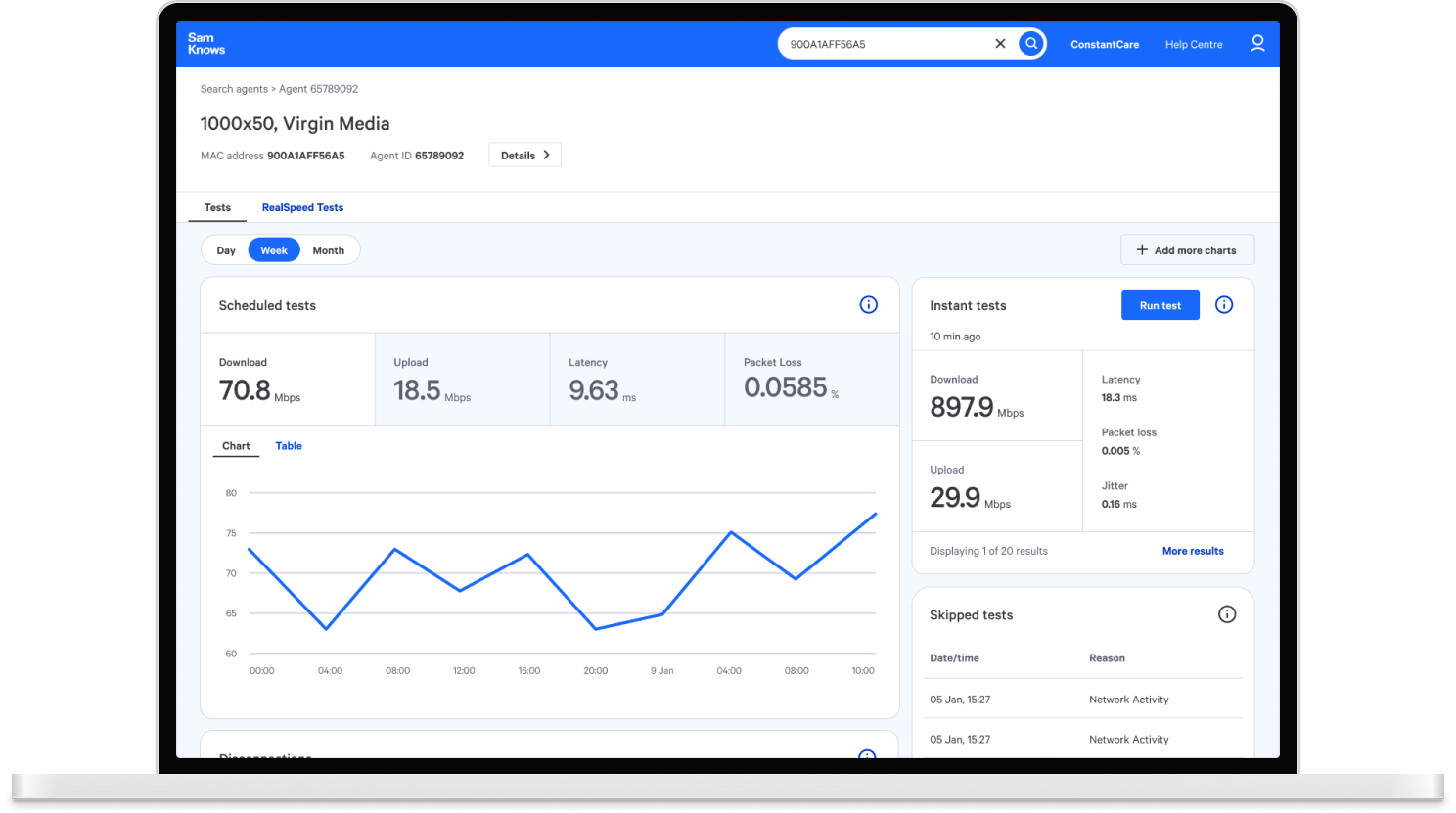
SamKnows Laptop mockup

Challenge

SamKnows had a growing number of products and applications that required a consistent and cohesive user experience. The existing design system lacked specific components to handle elevation levels, border radius variations, spacing and margins scale as well as crucial components, such as modals. There also wasn't a system for a new branch of mobile applications. This has led to inconsistencies between various parts of our software ecosystem and led to disjointed user experiences and increased development effort. My task was to design and implement these components as well as specify usage rules to improve overall design consistency and usability.

Scope of the project

Process

The work began with a full interface audit across web and mobile products. From the audit insights, I grouped patterns into themes, identified duplication issues, and created a prioritised roadmap for the first version of the system.

I worked closely with engineering to ensure components were feasible, scalable, and aligned with coding standards. Each component included states, accessibility guidelines, and usage rules. Documentation was created to make the system easy to adopt across the organisation.

Design solutions

Elevation

To provide a clear and consistent visual hierarchy and improve usability, I defined an elevation scale for our interface. The scale defined the shadow intensity and perceived distance from the surface of various components, ensuring that users could easily discern layers and interactions. It allowed designers and developers to assign different elevation levels to interactive UI elements such as tooltips, dropdowns, draggable components and modals.

After reviewing the existing use cases and considering future applications, I landed on a three-level scale. The elevation level increases with the importance of the UI component and the attention required from the user:

  • Low elevation - transient components closest to the surface (e.g. tooltips).
  • Medium elevation - interactive elements raised from the surface, such as typeahead dropdown and draggable items.
  • High elevation - components that sit above the interface and draw attention, e.g. modals and toast messages.

Beyond the visual examples shown below, I added implementation guidelines emphasising intentional elevation use to communicate content hierarchy, rather than using shadows decoratively.
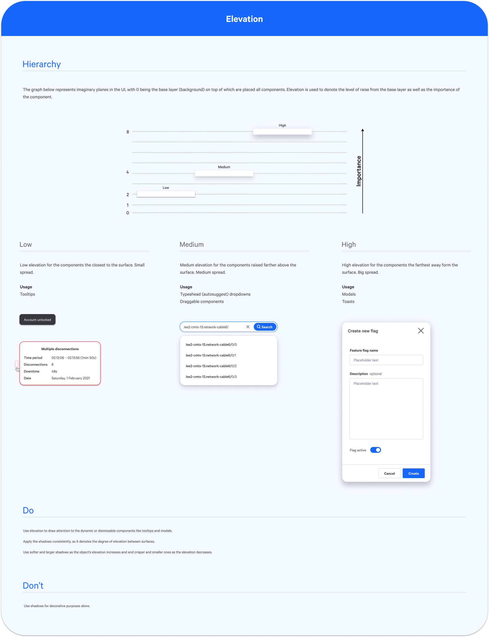
Elevation scale examples

Border radius

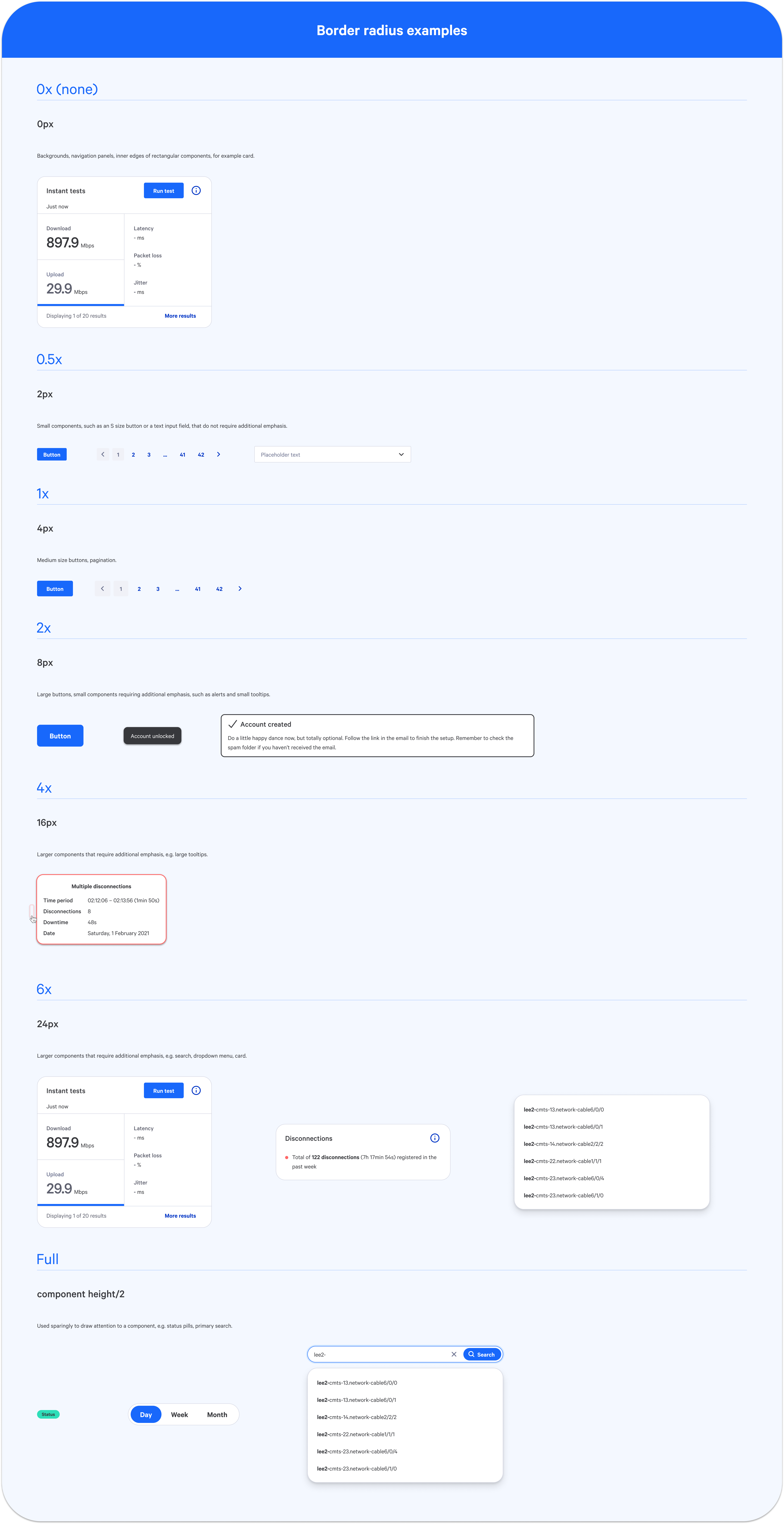
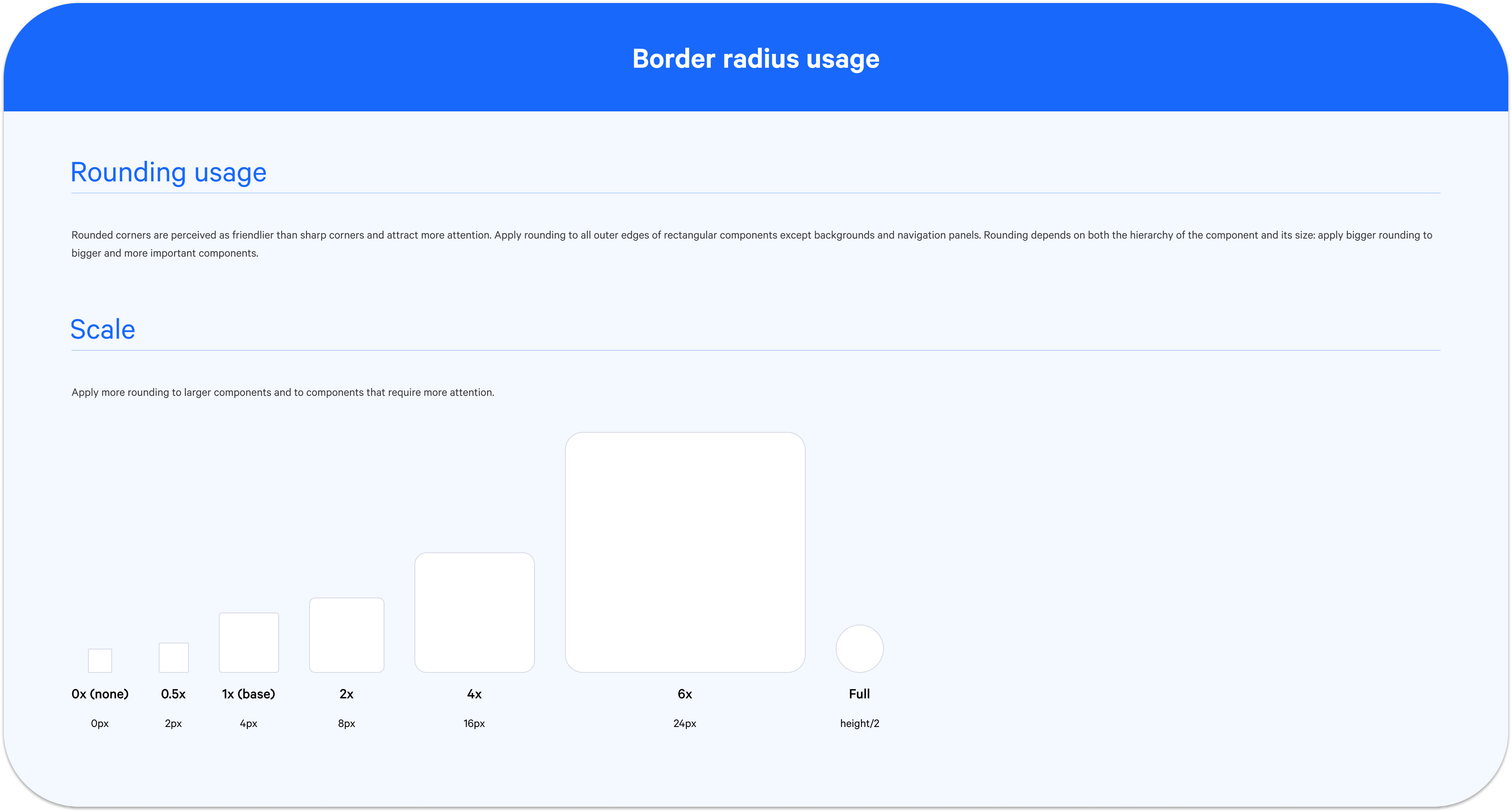
To harmonise the design and soften interface elements, I implemented a border radius scale. This scale set consistent radii for buttons, cards, and other components. It not only created more approachable, visually pleasing interfaces but also worked as an affordance, helping emphasise the component hierarchy.

Rounded corners are perceived as friendlier than sharp ones and attract more attention. At SamKnows, we apply rounding to all outer edges of rectangular components except backgrounds and navigation panels. Rounding varies based on both hierarchy and size: larger and more important components receive larger radii.

Border radius scale examples Border radius scale usage

Modals

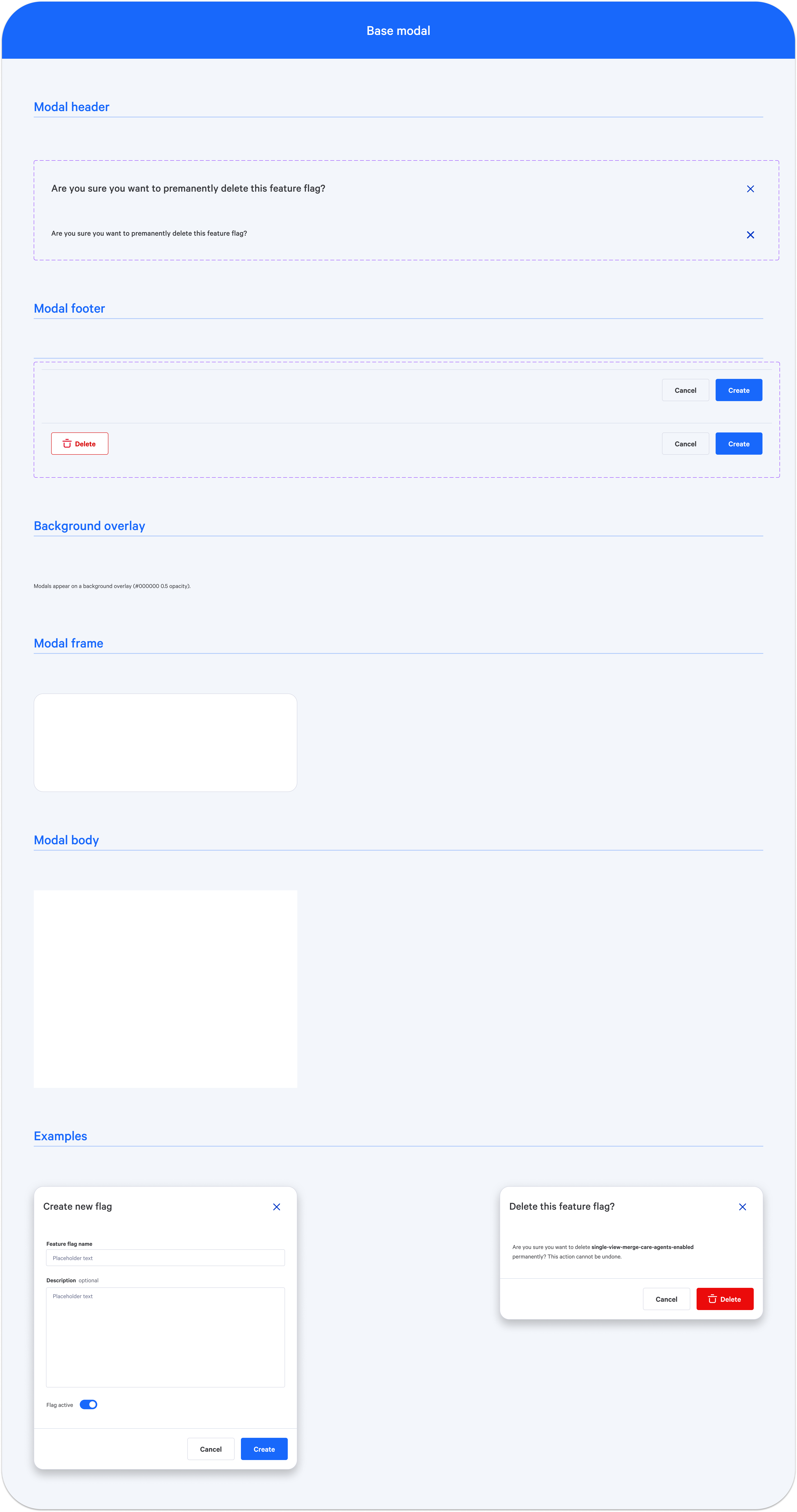
Our modals play a crucial role in guiding users through complex tasks and displaying important information. I redesigned them to offer a consistent and user-friendly experience. Key improvements included clear close buttons, a focus on accessibility, and well-defined usage rules to prevent misuse of this powerful UI pattern.

Modal design examples Modal component

Outcomes and impact

The implementation of these foundational design components resulted in a positive impact on the user experience of our tools and imrpovements in internal workflows:

Back to Selected Work